Most of us have stood in front of a deep emerald cushion or a cobalt blue planter and thought, “I love it, but I would never dare.” So we go home with beige again. Beige is safe, and it never looks wrong. It also rarely makes anyone’s heart beat faster.
Bold colour has the power to change how a room feels in seconds. A red cushion makes a sofa look inviting. A green tray makes a coffee table feel fresh. A blue planter turns a corner into a feature. The good news is that using colour well is not a talent you are born with; it is a set of simple decisions anyone can learn. This guide shows you how to choose bold shades, balance them, and build confidence step by step.
Why We Fear Colour, and Why We Should Not
The fear usually comes from one experience: a wall painted the wrong shade, or a room where too many colours fought each other. Colour mistakes are memorable, so we play it safe.
But colour has real benefits. Warm reds and oranges make a large room feel cosy and sociable. Blues and greens bring calm and freshness, welcome during a long Egyptian summer. Yellow lifts a dark corner. Colour can also hide imperfections, draw attention away from awkward features, and make a rented apartment feel personal without major changes.
Egyptian culture itself is full of confident colour: the turquoise doors of Nubian villages, the jewel tones of Ramadan lanterns, the saturated spice stalls of Khan El Khalili. Bold colour is not foreign to us. It is a heritage worth bringing home.
Start Small: The Accent Approach
If you are nervous, begin with accessories. They are affordable, easy to move and simple to change if you change your mind.
Cushions First
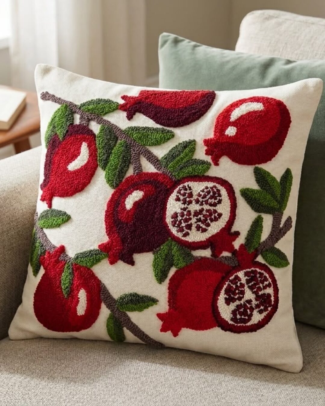
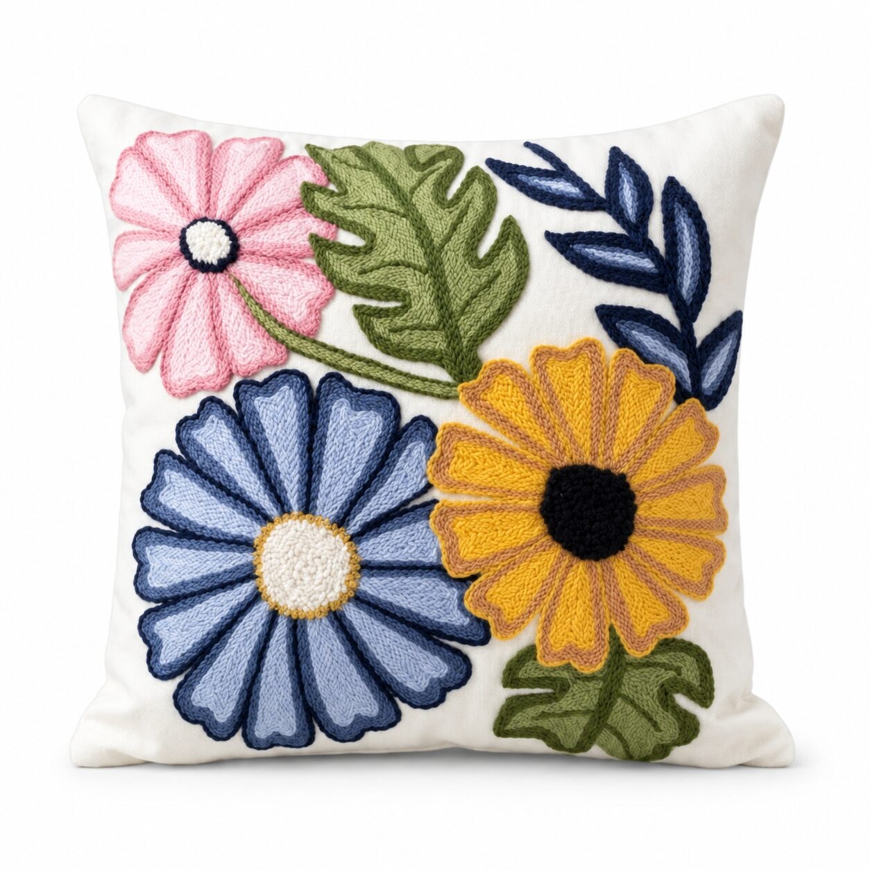
A single bold cushion is the gentlest introduction. The Crimson Pomegranate Tufted Cushion brings rich, deep red with a handmade tufted texture. Place it on a neutral sofa and watch how the whole room seems warmer. Once you are comfortable, add a second cushion that picks up the same red in a pattern, then a third in a related colour.
Small Objects
Next, add colour through objects on surfaces:
- A coloured mug on the kitchen shelf
- A vivid tray on the coffee table
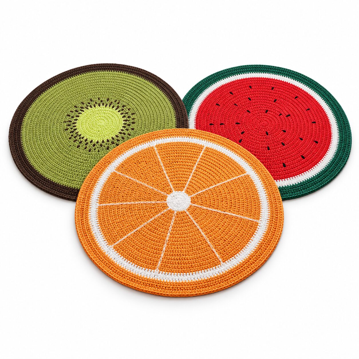
- Multicolour coasters that bring several shades at once
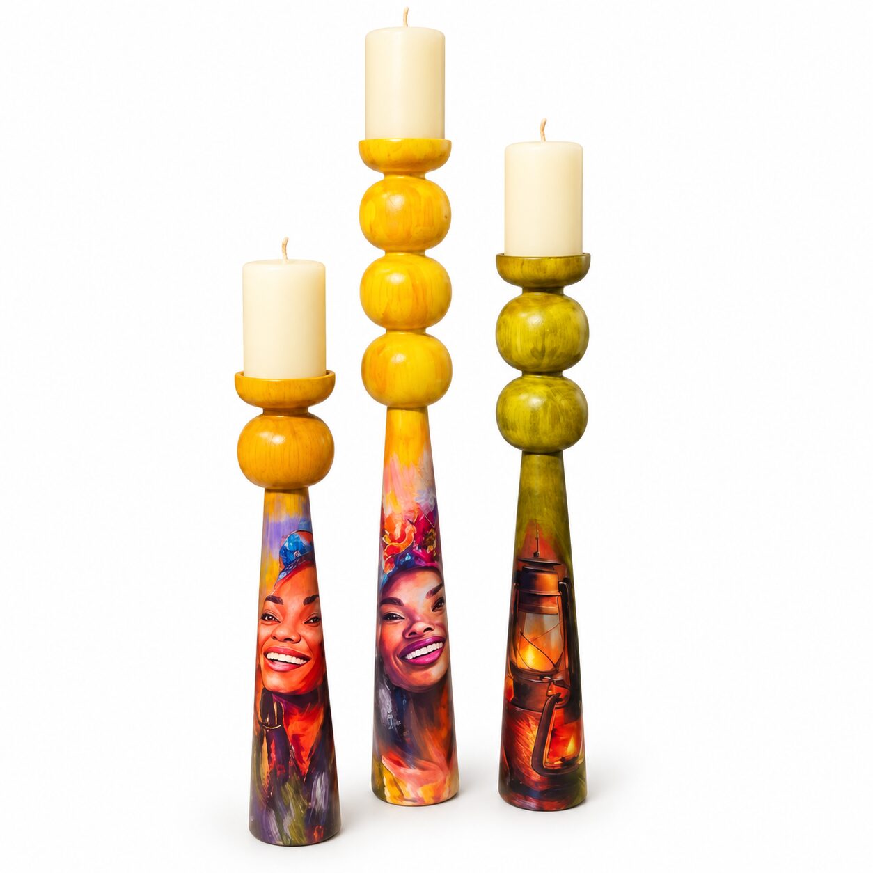
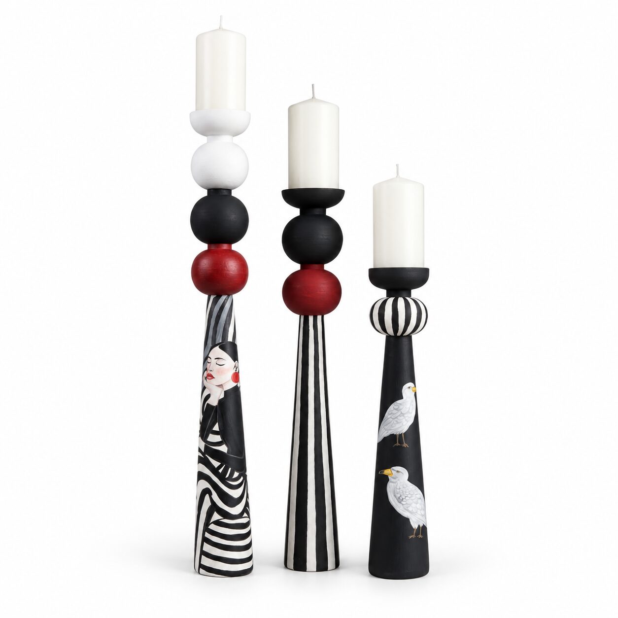
- A painted vase or candle holder
The Emerald Quatrefoil Wooden Tray is an excellent example: a strong emerald with a classic pattern that works as both serving piece and display base.
Notice How You Feel
Live with your accents for a couple of weeks. Do you smile when you see them? Do they feel like too much or not enough? Your reactions will guide your next, bolder step.
Understand the Colour Wheel, Simply
You do not need art school. Just three ideas will help you combine colours with confidence.
Complementary Colours
Colours opposite each other on the wheel, such as blue and orange, red and green, or purple and yellow. They create energy and contrast. Use one as the main colour and the other as a small accent.
Analogous Colours
Colours next to each other, such as blue, teal and green, or red, orange and yellow. They feel harmonious and calm, even when bold. This is the easiest scheme for beginners.
Tonal Schemes
Several shades of one colour, from light to dark. A room in pale aqua, turquoise and deep teal feels sophisticated and immersive.
The 60-30-10 Rule
Designers often use a simple proportion to keep bold colour balanced:
- 60 percent of the room in a dominant colour, usually walls and large furniture.
- 30 percent in a secondary colour, such as curtains, a rug or an accent chair.
- 10 percent in an accent colour, through cushions, art and objects.
For a beginner, the 60 percent might stay neutral while the bold colours live in the 30 and 10. For the confident, the 60 itself can be colourful, such as a deep green wall, with neutrals moving into the smaller roles.
Choosing Your Bold Palette
Jewel Tones
Emerald, sapphire, ruby and amethyst feel luxurious and rich. They suit evening rooms, dining areas and formal reception rooms, and they look stunning with gold and dark wood. The Art Deco Burgundy and Gold Tray captures this glamorous mood in one handcrafted piece.
Mediterranean Brights
Cobalt, turquoise, lemon yellow and white bring the energy of a sunny coast. They suit kitchens, breakfast nooks and balconies. The Mediterranean Lemon Cushion instantly suggests summer lunches in the sun.
Earthy Bolds
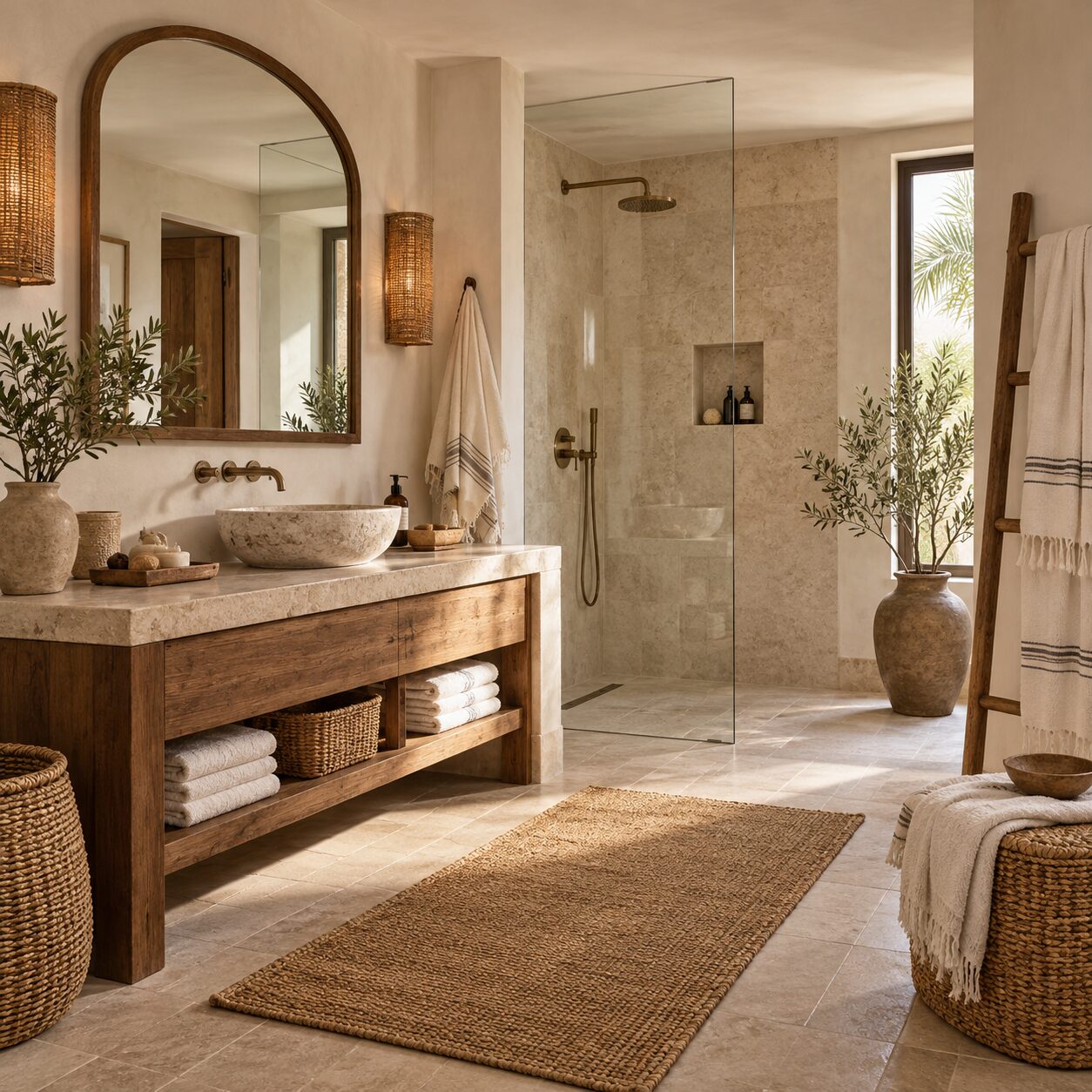
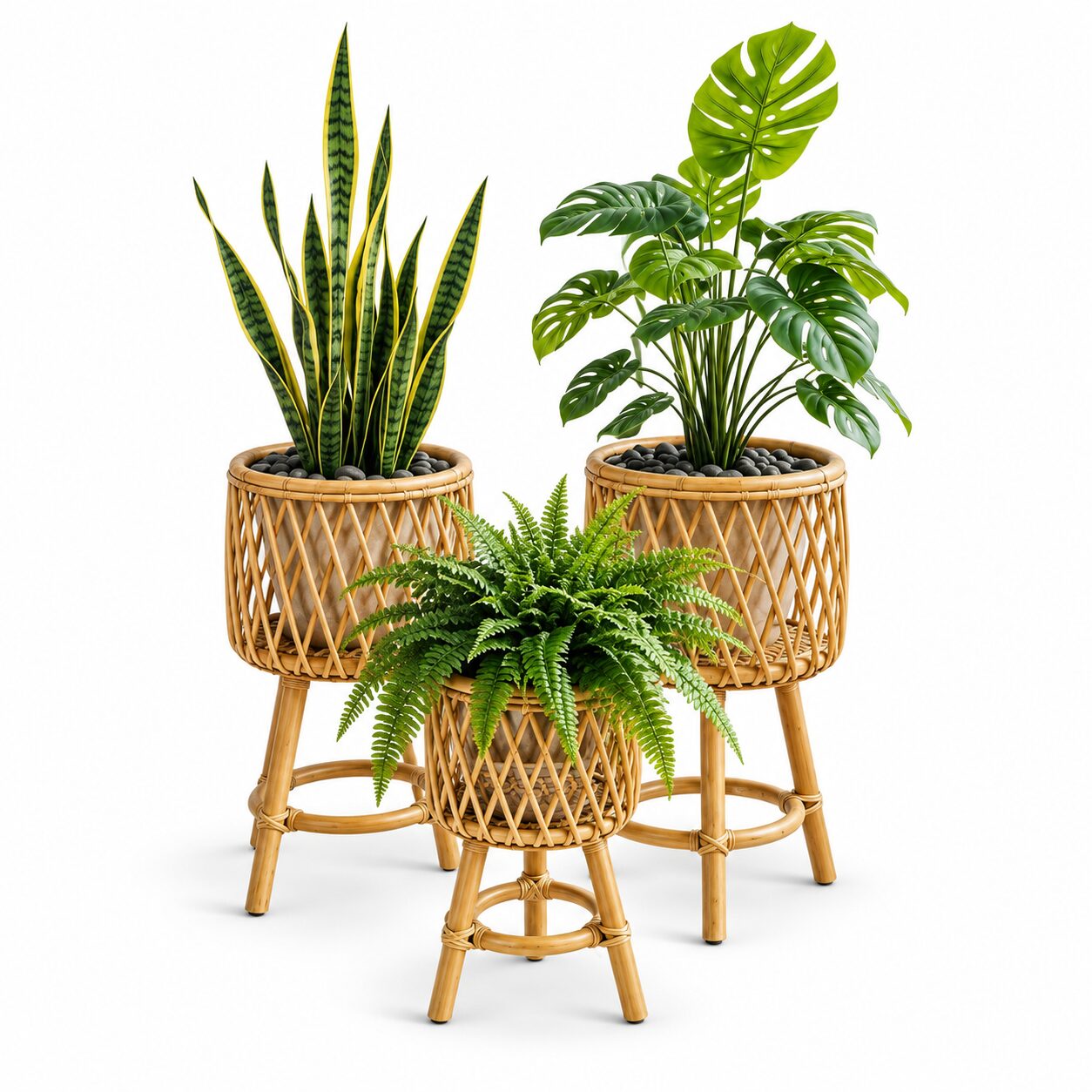
Terracotta, mustard, olive and burnt orange are bold yet grounded. They pair beautifully with natural materials like jute, halfa and wood, and feel especially at home in Egyptian light. A Large Olive Green Terracotta Planter adds both colour and handmade character to a corner.
Blues for Calm Energy
Blue is the most universally loved colour and an easy bold choice. From navy to turquoise, it feels fresh rather than overwhelming. A Navy and Beige Kilim Rug brings deep blue to the floor while the beige keeps it grounded.
Layering Colour Through a Room
Once you have chosen a palette, repeat it so it feels intentional.
- Repeat each colour at least three times, in different objects and at different heights.
- Spread it around rather than concentrating it in one corner.
- Vary the material, so the same red appears in velvet, ceramic and paint.
- Link rooms by carrying one colour from the living room into the dining area or entrance.
For example, in a living room with a teal and mustard scheme, you might use a teal cushion on the sofa, a mustard throw, a teal vase on a shelf, a print that contains both colours and a mustard lampshade. Each piece reinforces the others.
Balancing Bold With Calm
Even the most colourful rooms need breathing space. Balance comes from three things.
Neutrals
White, cream, beige, grey and black give the eye somewhere to rest. They make bold colours look even brighter by contrast.
Natural Textures
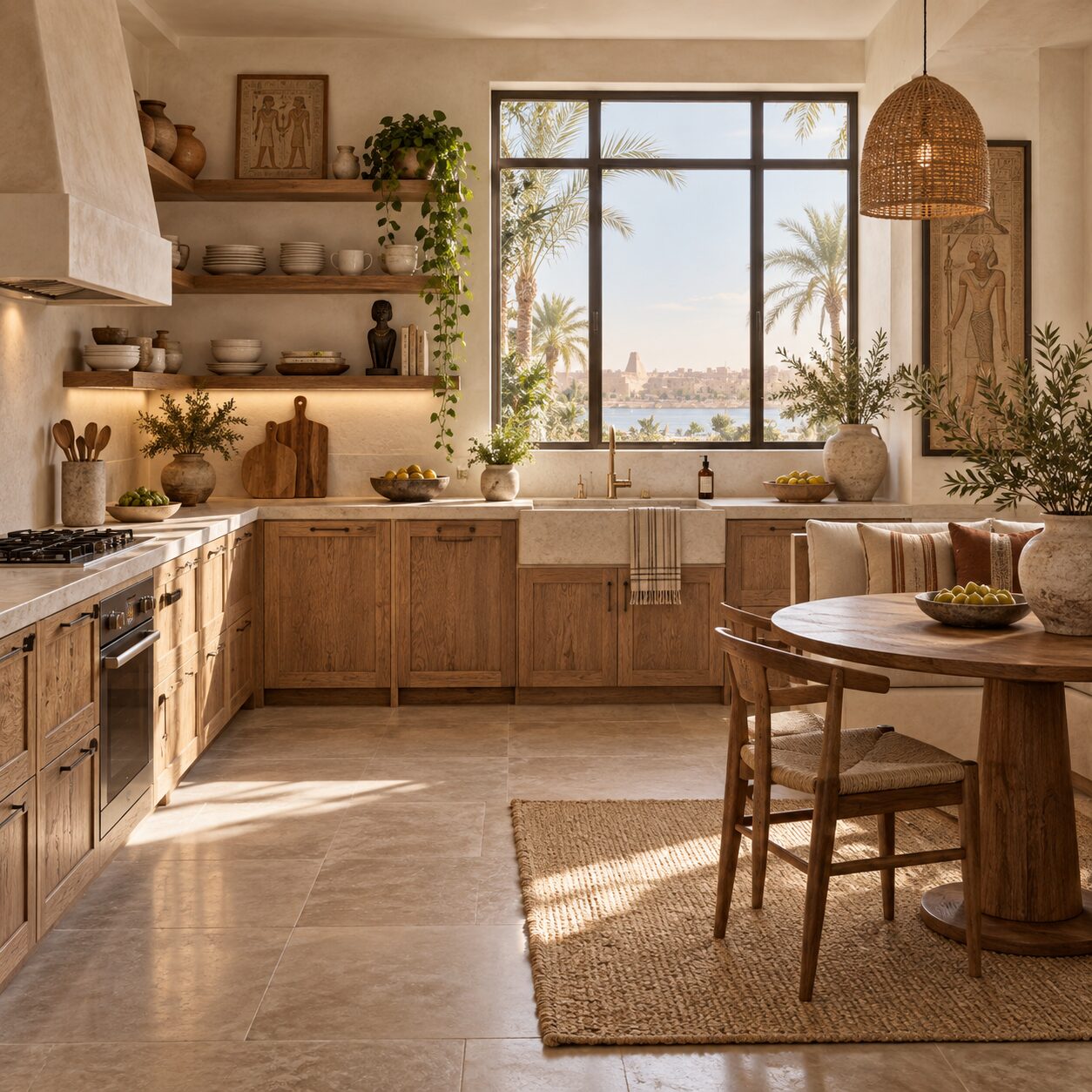
Jute, halfa, wood and linen bring warmth and softness. They calm bold colour without dulling it.
Negative Space
Not every wall needs art and not every surface needs an object. Empty space lets colourful pieces stand out.
Bold Colour Room by Room
Living Room
Start with cushions and a throw, then add a rug and art. The most confident step is an accent wall or a coloured sofa.
Dining Room
Dining rooms are perfect for drama because we use them mostly in the evening. Deep jewel tones, coloured table runners and bold trays look stunning by candlelight, especially at a Ramadan iftar.
Bedroom
Choose calmer bold colours here: deep blue, forest green or dusty terracotta. Use them in bedding or a headboard wall and keep the rest soft.
Kitchen
Kitchens love cheerful colour. Coloured mugs, bowls, tea towels and a bold runner bring energy to morning routines. Open shelves are ideal for grouping colourful ceramics by shade, which turns everyday dishes into a display and makes the whole kitchen feel more cheerful at breakfast.
Entrance
A bold colour at the door gives a confident first impression: a painted wall, a vivid rug or a colourful mirror frame.
Bold Colour When You Rent
Many Egyptian families rent, and landlords rarely welcome a cobalt wall. Fortunately, the most effective colour lives in things you can take with you.
- Rugs cover large areas and change a room more than almost anything else.
- Curtains in a strong colour frame windows and add height.
- Large planters in vivid glazes act like sculpture in a corner.
- Art and wall plates bring colour to walls without paint, and need only a couple of small hooks.
- A painted piece of furniture, such as an old side table or chair you already own, can become a confident focal point.
Because these pieces move with you, every investment in colour carries into your next home.
Shifting Colour With the Seasons
Bold colour does not have to stay the same all year. Keep a neutral base and swap accents with the seasons. In summer, lean on fresh blues, turquoise, lemon and leafy green, which feel cooling in the heat. In winter, bring out deep red, burgundy, mustard and forest green, which make evenings feel warm and enveloping. For Ramadan and Eid, jewel tones and gold accents create an instantly festive mood. Store off-season cushion covers and small objects in a lidded basket so switching takes minutes.
Lighting Changes Everything
Colour looks different under different light. Before committing to a large item or a painted wall, check it at several times of day.
- Strong Egyptian daylight can wash out pale colours and intensify bright ones.
- Warm evening light deepens reds and oranges and softens blues.
- Cool white bulbs can make warm colours look dull.
Use warm bulbs in living areas so bold colours glow rather than glare. A colourful table lamp, such as the hand-painted Magenta Petal Lamp, adds colour by day and a soft, tinted glow by night.
Common Mistakes to Avoid
- Too many unrelated colours. Choose a palette of three or four and stick to it.
- Colour in one spot only. A single colourful item can look random. Repeat it.
- Ignoring undertones. Warm and cool versions of the same colour can clash. Hold items side by side before buying.
- Forgetting neutrals. Without calm areas, bold colour becomes tiring.
- Painting before testing. Always try a sample on the wall and view it in daylight and lamplight.
- Following trends blindly. Choose colours you genuinely love, not only what is popular this year.
Quick Checklist
- Start with one or two bold accessories
- Choose a palette using complementary, analogous or tonal colours
- Follow the 60-30-10 proportion
- Repeat each colour at least three times
- Balance with neutrals and natural textures
- Leave negative space
- Check colours in both daylight and evening light
- Use warm bulbs to make colours glow
Be Brave, One Piece at a Time
Confidence with colour grows with each small success. A red cushion leads to a green tray, which leads to a blue rug, and before long your home has a personality that is unmistakably yours. Remember that accessories are easy to change, so there is little risk in trying.
Explore colourful cushions, hand-painted trays, terracotta planters and vivid kilim rugs at coccarohome.com, and bring a little boldness home today.
Shop the Look
- Crimson Pomegranate Tufted Cushion — EGP 1,600 — Deep red with handmade texture for a first bold step.
- Emerald Quatrefoil Wooden Tray — EGP 3,700 — Rich emerald with a classic pattern.
- Art Deco Burgundy and Gold Tray — EGP 3,700 — Jewel-toned glamour for the dining table.
- Mediterranean Lemon Cushion — EGP 1,400 — Sunny yellow that brings instant summer energy.
- Large Olive Green Terracotta Planter — EGP 4,752 — Earthy bold colour in handmade terracotta.
- Large Blue Terracotta Planter — EGP 4,752 — A striking blue feature for a corner or balcony.
- Navy and Beige Kilim Rug — EGP 2,484 — Deep blue on the floor, grounded by beige.
- Turquoise Floral Embroidered Cushion — EGP 980 — Fresh turquoise in handcrafted embroidery.
- Magenta Petal Hand-Painted Table Lamp — EGP 4,950 — Colour by day, a warm glow by night.
- Multicolour Rope Coasters — EGP 605 — An easy, playful way to add several colours at once.