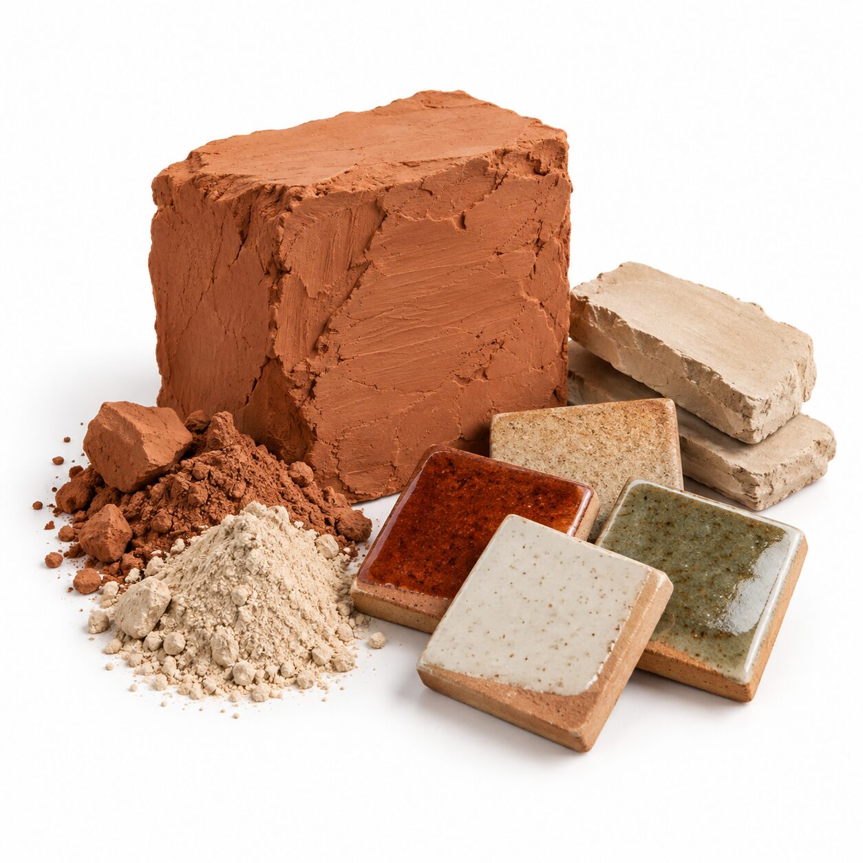
Some homes feel calm the moment you walk in. The light seems softer, the rooms seem quieter, and you find yourself breathing a little more slowly. Very often, the secret is colour. Earth tones and neutrals, the colours of sand, clay, stone, olive leaves and sun-dried grass, have a grounding effect that bright, high-contrast palettes rarely achieve.
For Egyptian homes, these colours feel especially natural. They echo the desert, the Nile banks, the limestone of old Cairo and the terracotta of village pottery. They also handle the strong Egyptian sunlight gracefully and hide the fine dust that every household knows well. This guide explains how to build an earthy, neutral palette that feels calm without ever feeling dull.
What Are Earth Tones and Neutrals?
The two groups overlap, but they are worth separating.
Neutrals
Neutrals are the quiet base colours of a room: white, off-white, cream, ivory, beige, greige, taupe and soft grey. They do not demand attention. Instead, they create a backdrop that lets furniture, texture and light take centre stage.
Earth tones
Earth tones are warmer and richer colours drawn from nature:
- Sand and camel, the colours of the desert.
- Terracotta and clay, the colours of pottery and brick.
- Olive and sage, the colours of olive groves and dried herbs.
- Rust and ochre, the colours of spices and autumn leaves.
- Walnut and chocolate brown, the colours of wood and soil.
- Muted mustard, the colour of late-afternoon sun.
A calm home typically uses neutrals as the foundation and earth tones as the accents that add warmth and depth.
Why These Colours Create Calm
There are good reasons earthy palettes feel restful.
- They are familiar. Our eyes are used to these colours in nature, so they read as comfortable and safe.
- They have low contrast. Soft transitions between colours reduce visual noise.
- They are warm. Most earth tones have warm undertones, which feel welcoming.
- They age well. Neutral and earthy rooms rarely look dated, because they are not tied to a passing trend.
- They suit natural materials. Jute, halfa, cotton, linen, wood and clay all naturally belong in this palette, which makes decorating easier.
Building Your Palette: The 60-30-10 Approach
A simple rule helps you balance colours across a room. Designers often use a 60-30-10 split:
- 60 percent: the main neutral. Walls, large rugs and big furniture. Think warm white, cream or soft beige.
- 30 percent: the secondary tone. Curtains, an armchair, bedding, a large throw. A deeper neutral like taupe, sand or light brown works well.
- 10 percent: the accent. Cushions, vases, art and small objects. This is where terracotta, olive, rust or mustard come in.
Sample palettes
- Desert calm: cream walls, sand-coloured sofa, terracotta and camel accents.
- Olive grove: warm white walls, beige sofa, olive green and wood accents.
- Nile clay: soft greige walls, taupe textiles, rust and brown accents.
- Soft stone: off-white walls, light grey sofa, oatmeal textiles and black details for definition.
Choose one palette and repeat it across connected rooms, especially in open-plan apartments, so the home feels unified. Before committing, gather small samples, such as a cushion cover, a paint card and a piece of wood, and look at them together in the room where they will live.
Texture: The Secret to Neutral Rooms That Are Not Boring
The biggest risk with a neutral palette is flatness. When colours are quiet, texture has to do the talking. Aim to include several different textures in every room.
Woven fibres
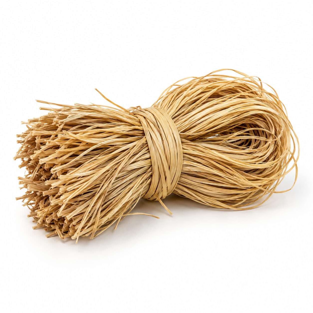
Jute, halfa and cotton rope add depth and a natural, handmade feel. A Jute Storage Basket with Olive Accents brings both texture and a touch of green in one practical piece.
Textiles
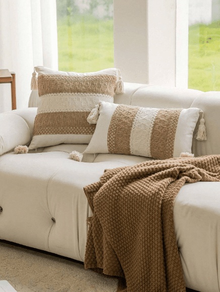
Mix smooth linen with nubby boucle, chunky knits and tufted designs. The Boho Neutral Lumbar Cushion adds soft texture to a beige sofa, while a textured off-white kilim cushion layers pattern without adding strong colour.
Natural surfaces
Wood grain, matte pottery and stone-like ceramic finishes add visual weight. A Rustic Beige Pottery Pitcher Vase looks beautiful on its own and suits almost any neutral setting.
Rugs
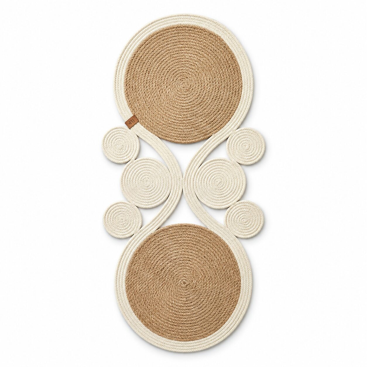
A rug grounds the palette and brings texture underfoot. The Jute and Off-White Earthen Circle Rug combines two natural tones in a soft, organic shape.
Adding Earth-Tone Accents
Once your neutral base is in place, introduce earth tones deliberately. A little goes a long way.
Olive and green
Green is the most calming accent colour, and olive is its earthiest version. Use it in cushions, vases and greenery. An Olive Metallic Tall Pottery Vase adds a subtle sheen and a strong vertical line. Artificial olive branches bring the same colour with a natural shape.
Terracotta and rust
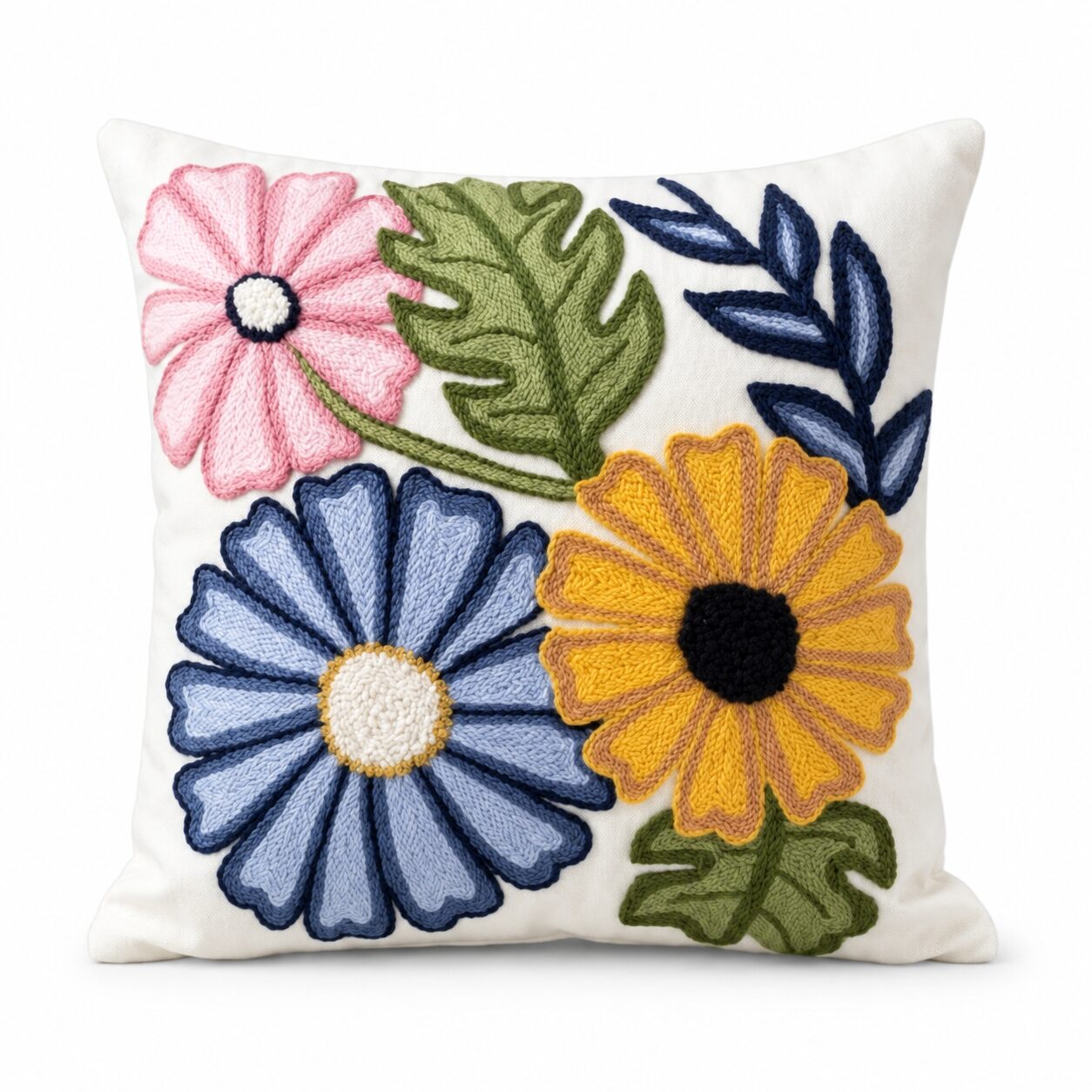
These colours add warmth and energy. Use them sparingly in a cushion, a pot or a piece of art. The Sunset Geometry Cushion combines terracotta and mustard with navy for a modern, graphic accent.
Browns and wood
Wooden trays, bowls and furniture provide the darker tones that stop a neutral room from feeling washed out. Mix wood tones, but keep them in the same warm family.
Black as a detail
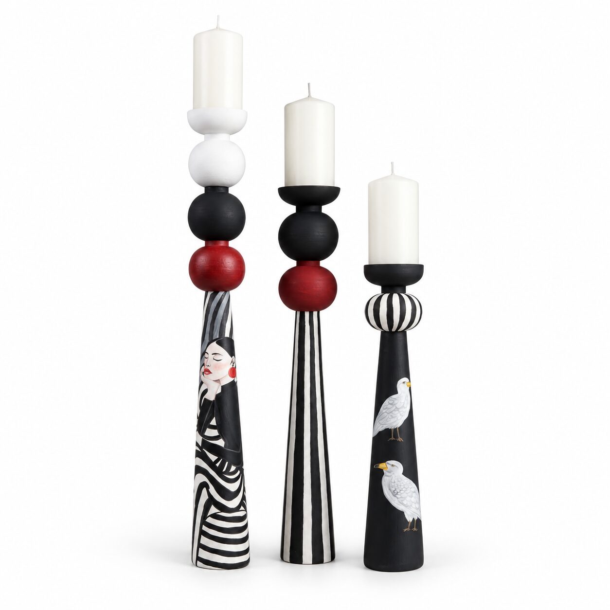
A few black details, such as a picture frame, a lamp base or a patterned cushion, give definition to a soft palette and keep it looking modern.
Room-by-Room Ideas
Living room
Start with a cream or beige sofa. Add cushions in two textures and one earthy accent colour. Place a jute rug underneath, a wooden tray on the coffee table and a pottery vase with olive stems nearby.
Bedroom
Keep the bedroom the calmest room of all. White or oatmeal bedding, a linen throw, and soft beige or sage accents. Add wooden bedside pieces and a woven basket for spare blankets.
Dining room
A wooden table with a natural linen runner is a classic earthy look. The Embroidered Linen Table Runner in neutral beige with white leaf embroidery suits everyday meals and family gatherings alike. Add rope placemats and a simple pottery centrepiece.
Kitchen
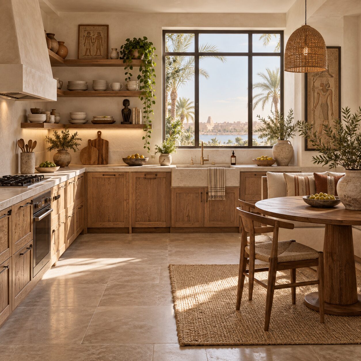
Earth tones work beautifully with wooden counters and cabinets. Add matte ceramic mugs, woven bread baskets and a wooden cutting board on display. A Gray Stone Matte Ceramic Mug is exactly the kind of quiet, tactile piece that makes a morning coffee corner feel considered. Keep countertops as clear as possible, so the few objects on display stand out.
Bathroom
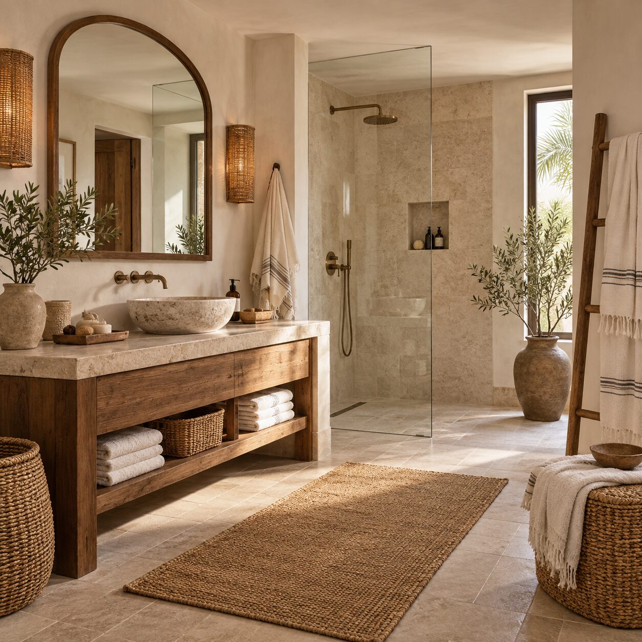
White or cream towels, a jute basket and a small plant create a spa-like feel. Keep the palette very light and let texture carry the interest. Fold towels neatly on an open shelf or a wooden stand, choose a natural fibre basket for spare rolls and toiletries, and pick a soap dispenser in matte ceramic or stone tones rather than bright plastic. Small swaps like these make even a compact Egyptian apartment bathroom feel calm and put-together.
Working With Egyptian Light
The strong sunlight in Egypt changes how colours look throughout the day.
- North-facing rooms get cooler, softer light. Warmer neutrals like cream and beige keep them from feeling cold.
- South- and west-facing rooms get intense, warm light. Slightly cooler neutrals, such as greige or soft stone, stop them from looking yellow.
- Test colours on the wall and look at them morning, afternoon and evening before deciding.
- Consider dust. Very pure whites show dust quickly on textiles; oatmeal, sand and taupe are more forgiving.
- Use sheer curtains in a neutral tone to soften harsh midday light without darkening the room.
Keeping the Palette Fresh Through the Year
One of the best things about an earthy, neutral home is how easily it adapts. Because the base is calm, small changes in accessories shift the mood without any repainting.
Summer
Lighten the look with more white and cream, crisp cotton, and cooler accents like sage and soft stone. Put heavier throws away and let woven fibres and pale wood lead.
Autumn and winter
Bring in deeper tones: rust, mustard, chocolate brown and olive. Add a knitted throw, a wool-blend rug and more candles. The same beige sofa suddenly feels cosy.
Ramadan and Eid
A neutral base is the perfect canvas for festive decor. Brass or gold lanterns, deep green or burgundy table linens and warm lighting stand out beautifully against cream and sand, and they can be packed away afterwards without leaving the room looking bare.
Everyday rotation
Keep a basket of spare cushion covers in two or three accent colours. Swapping them takes five minutes and gives the living room a new personality whenever you feel like a change.
Because every season builds on the same neutral foundation, you buy fewer items overall, and each new accent works with everything you already own.
Common Mistakes With Neutral Palettes
- Too many similar beiges with no contrast. Add at least one darker tone and one accent colour.
- No texture. Flat fabrics and smooth surfaces make a neutral room look lifeless.
- Mixing warm and cool neutrals randomly. Pick a temperature and stay mostly within it.
- Ignoring lighting. Cool bulbs can make warm neutrals look grey and flat.
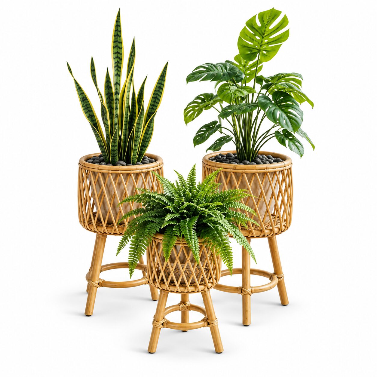
- Forgetting greenery. Plants, real or artificial, bring life to earthy spaces.
- Choosing everything in one shop visit. A layered neutral room is built gradually.
Quick Checklist
- Choose one neutral base colour for walls and large pieces.
- Pick a secondary tone for textiles and upholstery.
- Select one or two earth-tone accents.
- Follow the 60-30-10 balance.
- Include at least three textures in each room.
- Add wood for depth and a few black details for definition.
- Bring in greenery.
- Test colours in your home’s light at different times of day.
A Calm Home, Naturally
Earth tones and neutrals create homes that feel restful, timeless and deeply connected to the natural world. With a thoughtful palette, rich texture and a few well-placed accents, your home can become the calm retreat you look forward to at the end of every day.
Discover neutral cushions, jute baskets, pottery vases, rugs and natural table linens at coccarohome.com, with delivery across Egypt, and bring a calm, earthy palette into every room.
Shop the Look