Choosing colours for a room from a blank wall is hard. There are thousands of paint chips, endless fabric swatches and too many opinions. Designers often solve the problem the other way round. They start with one patterned object they love, usually a rug, a painting or a cushion, and let it hand them a palette that is already balanced.
A cushion is the easiest place to begin. It is small enough to carry around, affordable enough to choose freely, and someone, often a skilled craftsperson, has already done the hard work of putting colours together that look good side by side. All you have to do is read them and repeat them around the room. This guide shows you how to turn one cushion into a complete, confident colour scheme.
Why a Cushion Works So Well
A good patterned cushion is effectively a ready-made colour plan. The maker has chosen a dominant shade, a few supporting tones and usually one small spark of contrast. Those proportions are exactly what a room needs.
Starting with a cushion also keeps you honest. Instead of choosing colours in the abstract, you choose something you actually like enough to live with every day. If you love the cushion, you will probably love a room built around it.
And because cushions are portable, you can carry one to the shop, hold it against a rug or throw, and see immediately whether the colours work together. That is far more reliable than trying to remember shades from memory.
Step One: Choose the Right Cushion
Not every cushion makes a good starting point. Look for:
- Three to five distinct colours. Enough to build a palette, not so many that it becomes chaotic.
- A pattern you genuinely love, not just a colour you think is fashionable.
- A mix of light, medium and dark tones, which gives you contrast to work with.
- Colours that suit your fixed elements, such as floor tiles, kitchen cabinets or a sofa you are keeping.
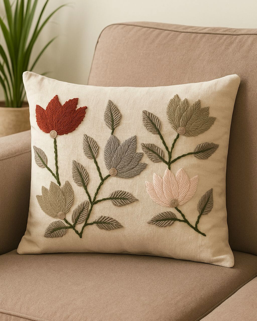
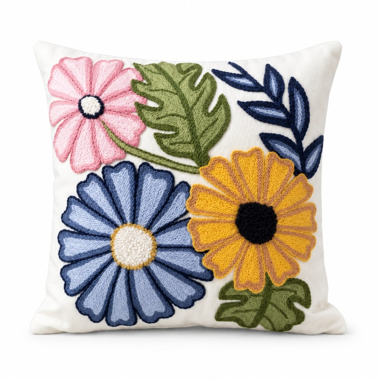
The Geometric Tufted Multicolour Cushion is a perfect example: a lively mix of colours on a neutral background, with enough range to inspire a whole living room. The Lotus Embroidered Cushion offers a softer option, with a floral design in beige, red, pink and green that suits a warmer, gentler room.
Step Two: Read the Colours
Put the cushion in natural daylight, near a window, and look at it carefully. Then sort what you see into three groups.
The Background Colour
This is usually the largest area of the cushion, often a neutral such as cream, beige, white or grey. It tells you the base tone of the room: walls, large furniture and big floor areas.
The Main Pattern Colours
These are the two or three colours that make up most of the design. They become your supporting colours: the rug, curtains, a throw, an accent chair.
The Spark
Look for the smallest, brightest or darkest colour, often a thin outline or a tiny motif. This is your accent, used sparingly in small objects for energy and contrast.
Take a photo of the cushion and keep it on your phone. When you are shopping, you can check colours against it in seconds.
Step Three: Apply the 60-30-10 Rule
Once you have your colours, use the classic proportion that designers rely on.
- 60 percent: the dominant colour. Usually the cushion’s background or most neutral tone. Walls, the sofa, large rugs.
- 30 percent: the secondary colour. One or two of the main pattern colours. Curtains, a rug, an armchair, throws, a cabinet.
- 10 percent: the accent. The spark. Cushions, vases, candles, a lamp base, small artwork.
This proportion keeps the room calm while still feeling colourful. Most rooms that feel “off” have the proportions reversed, with too much of a bold colour and not enough of a calm one.
An Example
Take the Boho Geometric Tassel Cushion in mint green, brown and white. A room built from it might look like this:
- 60 percent white and warm off-white: walls, sofa, sheer curtains.
- 30 percent brown and natural wood: coffee table, a halfa or jute rug, wooden frames, a woven basket.
- 10 percent mint green: a second cushion, a vase, artificial greenery, a small painting.
The cushion itself then sits on the sofa as the piece that ties everything together.
Step Four: Carry the Colours Around the Room
A palette only works when colours repeat. A colour that appears once looks random; a colour that appears three times looks planned.
The Rule of Three
Repeat each supporting and accent colour in at least three places, spread around the room rather than clustered together. If olive green is one of your colours, it might appear in a cushion on the sofa, a basket on the floor and a plant on the shelf.
A basket is one of the easiest ways to carry a colour. The Olive Green Jute Basket with Wooden Beads brings a muted green into a corner while doing useful storage work for throws and magazines.
Rugs
A rug covers a large area, so it usually carries the dominant or secondary colour. Choose one that repeats the cushion’s background or a main pattern colour, rather than the accent. A black and white cushion, for instance, pairs naturally with a graphic kilim rug in the same tones.
Throws and Textiles
Throws are the easiest way to move colour around and change it with the seasons. A Black and White Abstract Throw carries a monochrome palette from the sofa to an armchair or the end of the bed.
Table Linens
In open-plan homes where the living and dining areas share one space, table runners and placemats carry the palette across the room. A Kilim Table Runner can echo the colours of a kilim cushion on the sofa so both zones feel connected.
Walls and Art
If you are painting, choose a wall colour from the cushion’s lightest neutral. For art, look for pieces that include at least one colour from your palette.
Palettes to Try
Here are a few starting points, each based on the kind of cushion you might already love.
Earthy Boho
Cream, terracotta, mustard and olive. Natural halfa, jute and wood carry the brown tones, while a tufted cushion in warm colours provides the pattern. Perfect for Egyptian homes that already have warm wooden furniture.
Mediterranean Fresh
White, lemon yellow, leafy green and a touch of blue. The Mediterranean Lemon Cushion could anchor this whole scheme, with white walls, a natural rug, green plants and blue ceramics. It feels like a summer holiday on the North Coast all year round.
Coastal Calm
Sandy beige, soft white, sea blue and a pop of coral. Inspired by the Red Sea, it suits bedrooms and bright apartments with lots of daylight.
Graphic Monochrome
Black, white and grey with natural wood. A kilim cushion in black and white leads, with a grey solid cushion, a monochrome throw and wooden accents to keep it warm.
Soft Botanical
Greyish beige, sage, cream and a little brown. Leaf and palm patterns set the tone, and the room feels calm and restful, ideal for a bedroom.
When the Cushion Meets Fixed Elements
Most of us are not starting from an empty room. Floor tiles, kitchen cabinets, a sofa bought years ago or curtains that came with the apartment are all part of the palette, whether we like it or not. Treat them as colours too.
- Floors: many Egyptian apartments have beige, cream or grey ceramic or marble floors. Look for the cushion colour closest to your floor tone and let it be part of the 60 percent, so the floor feels intentional rather than something to hide.
- A strongly coloured sofa: if your sofa is navy, burgundy or green, choose a cushion that contains that colour. The sofa then becomes the 30 percent, and the cushion links it to everything else.
- Wooden furniture: warm wood counts as a brown in your palette. A cushion with a touch of brown, tan or terracotta will make wooden pieces look connected rather than heavy.
- Things you cannot change: if the curtains or the kitchen clash with your cushion, do not fight them in the same sightline. Use your new palette most strongly in the area where people sit and look, and keep the clashing element calm with neutrals around it.
The same thinking works beyond the living room. In a bedroom, take the palette from a cushion on the bed and repeat it in a throw, a bedside lamp and a small rug. In a dining area, take it from a seat cushion and repeat it in the runner, napkins and a vase.
Checking Your Palette in Real Light
Colours change dramatically through the day, especially in Egypt’s strong sunlight.
- Check colours morning, afternoon and evening. A cream that looks fresh at noon can look yellow under warm lamps at night.
- Look at north- and south-facing rooms differently. Rooms with strong afternoon sun suit cooler colours; darker rooms feel brighter with warm tones.
- Test before committing. Bring home a throw, a basket or a small rug and live with it for a few days before buying large items.
Common Mistakes
- Using every colour equally. Without a dominant shade, the room feels busy.
- Making the accent too big. A bright accent works in small doses, not as a whole wall or sofa.
- Matching too perfectly. Close shades and tones look richer than exact matches. Aim for harmony, not identical colours.
- Ignoring the neutrals. The cushion’s background colour matters as much as the pattern.
- Forgetting texture. A one-colour palette still looks interesting when textures vary: tufted, woven, knitted and smooth.
- Choosing a cushion you only half like. If it does not make you happy, it will not lead a room you love.
Quick Checklist
- One patterned cushion with three to five colours you love
- Background colour identified as the dominant shade
- Two or three pattern colours as supporting shades
- One small accent colour
- 60-30-10 proportions across the room
- Each colour repeated at least three times
- Palette checked in morning and evening light
One Cushion, a Whole Room
The best colour schemes often begin with something small and loved. Let one beautiful cushion make the decisions for you, then repeat its colours with rugs, throws, baskets and table linens until the whole room feels connected.
Browse tufted, embroidered and kilim cushions, along with throws, rugs and baskets to complete your palette, at coccarohome.com.
Shop the Look